
Overview
Most widgets in the website builder have design options that enable you to customize the widget’s appearance for your website. These options can help you create a widget that perfectly matches the style of your site or one that stands out and attracts visitor’s attention.
Guide
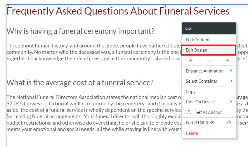
To open the Design Editor of a widget on your website, right-click on the widget to open the context menu and then click Edit Design. You can also open the Design Editor by clicking on the widget and then clicking Design at the top of the widget window.
Here are some common customization options you’ll find in the Design Editor.
Layout
Layout options are usually specific to certain widgets. To select from the set of layout options available for that widget, click the layout that appears in the Design Editor (or click the small arrow beside it) to open the Select Layout menu. To change the selected layout, click the layout you want to use instead and it will be updated in the widget.
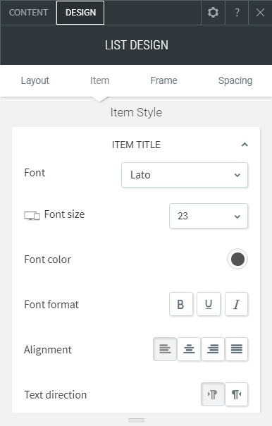
Style
- Color – click the round color icon to the right of the section name to open the color picker and change the color.
- Border Style – change the width of the border using the slider or text box.
- Background Style – use a background image or video for this widget using the Choose and Place Images dialog or a video URL.
- Width and Height – use the slider or text box to change the number of pixels.
- Rounded Corners – increase or decrease the rounded the corners on a widget.
- Shadows – toggle on or off a shadow for this widget.
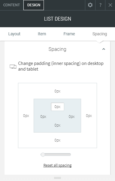
Spacing
Change the padding (spacing inside the widget edges) and margins (spacing outside the widget edges). Each number in the outer box sets the margins for its own side (top, bottom, left, or right), and each number in the inner box sets the padding for its own side (top, bottom, left, or right).
Need more help with this?
Don’t hesitate to contact us here.